My work spans consumer campaigns, partner co-branding and B2B brand design. I combine hands-on production with design systems and mentoring, helping teams carry the brand consistently across formats.
Brand and spatial design: Developed a design system and asset library, Enpal showroom and product-wall concepts, trade fair and MediaMarkt point-of-sale concept and execution,
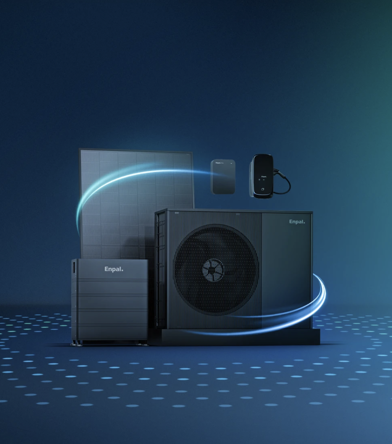
3D product visualisation: Modelled, shaded, lit and rendered still and animated product assets for web, print, paid ads and TV commercials. Currently developing an automated render pipeline.
Photography and art direction: Photographed Günther Jauch for Enpal’s global marketing assets and provided on-set art direction. Also handled performance-ad post-production, radio spot mastering and the TV commercial endboard.
Film production: Handled lighting, camera, sound, editing and post-production for Enpal films, including the Gustav Schäfer homestory.
Packaging and print: Designed Enpal.One packaging and prepared production-ready manuals, leaflets, booklets and product documentation, including colour, material and finish specifications.
Design management and mentoring: Briefed junior designers, gave design feedback, trained team members and coordinated their work.


BRLO reached out to me for help to redesign their website and incorporate their new core range of beers and consolidate a patchwork of separate websites into one with a cohesive design. With Webflow I found the perfect balance between advanced interactions and powerful CMS.
What was most enjoyable about this project was working with a team so dedicated to the core values of the company: diversity, inclusion, tolerance – and brewing damn good quality beer while keeping sustainability in mind. The brand design reflects this.


As part of the branding and corporate identity revision, I was invited to sharpen the brand's tone of voice and refine its purpose, which translated into design elements that accurately reflect the company's mission. Dropscan offers a fast, reliable, and secure SaaS product that maximizes flexibility and ease of use, making it a service at the intersection of automation and convenience.
The brand identity centers around paper and light, with a versatile and vibrant color palette that is used throughout the marketing website and customer-facing app. By balancing these elements with ample white space, the brand's personality is professional and modern.